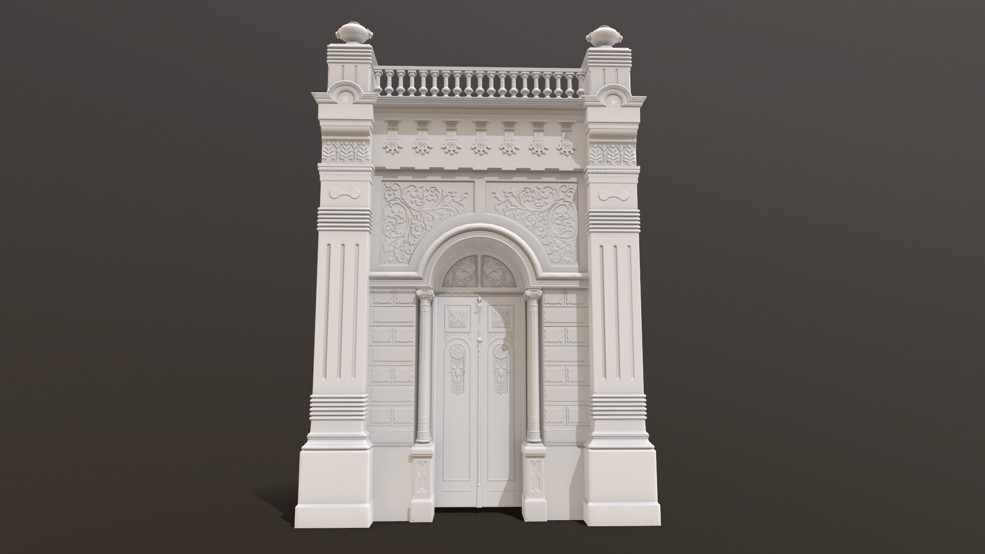
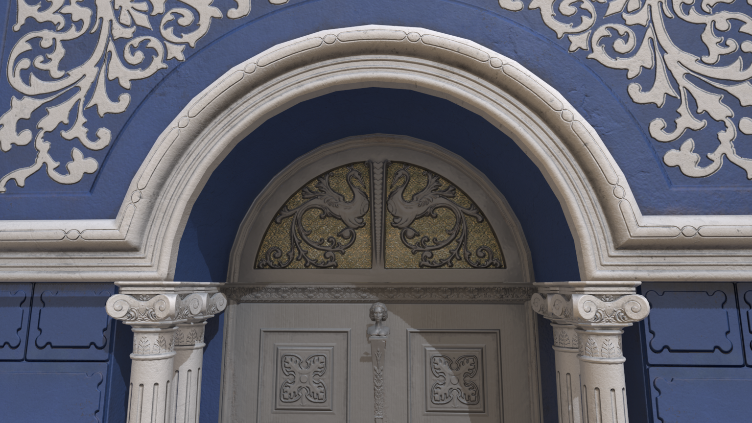
Here is the highly anticipated third installment of YurkP’s tutorial series! Today he will explain all about chamfer operation and UV unwrapping for his Cuban House of Diversity model. You can read last week’s segment about Flipped Normals and Smoothing Groups here.
Welcome to the last portion of this tutorial that is dedicated to modeling! At this point, I’ve explained all techniques that will be used for the rest of the model. The other components of the building will be created in a similar way.
Chamfer Operation
In this section, I’ll talk about chamfer operation. I've used chamfer here to create cavities on the corners, but it can also be used to smooth corners, which I find to be very useful.
First, I selected all the corners (image 1) and pressed the Connect button to move the lines away from each other (image 2). After, I applied Chamfer to an edge between the two lines with 3 iterations (image 3). This produced a chamfer with N-gons (image 4), unfortunately, but it can be fixed later.
From there, I moved the vertices of the new chamfered edge along the X and Y axes to make the ends more rounded (image 5) and applied Symmetry Modifier (image 6). I repeated this again on a different axis (image 7). Note that mirrors may need to be moved in order to achieve the desired look. From here, I cleaned up the model, fixed the topology (removed n-gons by creating quads and tris), and set new smoothing groups (image 8). I then ran a raw render to check everything out (image 9).
UV Mapping and UV Unwrapping
Now, let's move to UV mapping and unwrapping. It will appear difficult at first glance because it’s actually quite difficult to master. There are many applications and techniques for unwrapping, but I'll show you my method.
Q: What is UV Mapping?
A: UV Mapping projects a texture map onto a 3D object. The letters "U" and "V" denote the axis of the 2D texture because "X," "Y," and "Z" are already used to denote the axes of the 3D object in model space. (from Wikipedia). But in my own words: imagine that you have a 3D model and you want to paint the surfaces, but you prefer to paint on a flat plane. You would need to cut along the seams so that each surface can fall away from the model’s form and lay flat -- that’s part of UV mapping, but specifically it is the UV unwrapping process. Each 3D model can be unwrapped and put on a 2D layout. The process is very simple, but requires imagination.

Image Credit: Zephyris (Richard Wheeler)
Here is a nice example of how it works. After unwrapping the 3D model, it can be painted over in an image editing app (like Photoshop), and texture maps can be baked from high polygons on it. This is absolutely necessary, as you shouldn’t leave your model without textures.
Q: So, why would you use UV unwrapping instead of box mapping?
A: Unwrapping lets you create a unique texture, bake normal maps, and change your maps easily without setting that box mapping window again and again.
For my unwrapping process, first I consider the usage of UV space, which is limited with a square. That square is totally unique; all places around the square space will be tiled with the same texture. For unique textures, you need to keep yourself inside that zone. UV islands must be optimally packed to increase texture resolution and decrease the number of textures. Regarding pixel density: it should be the correspondent in all objects of your scene, otherwise, it’s possible to have an object with very blurry texture and an object with very detailed and sharp texture. (I've made such mistake in my previous models. Be sure to avoid it.)
 First, I created a checkered texture map. I have created 256x256, 512x512, 1024x1024 and 2048x2048 images with checkers. Texture maps always need to be such sizes (128, 256, 512, 1024, 2048, 4096, 8192) and each checker is sized at 32x32 pixels. The square sizes are necessary because some older GPUs don't support non-square maps in games. Despite the fact that new systems can support any texture proportions, it’s still good practice to use these resolutions to avoid any confusion and to make your game supportable by as many computers as possible.
After that, I have applied my map on all my objects. As you can see, the texture didn't apply as I wanted (image 1), and that’s because the model isn't unwrapped yet. So, I applied the Unwrap UVW Modifier and opened the UV layout window (image 2). If you create a simple box, you won't see such a mess in the window, but after several operations, the UV will be pretty broken. From there, I applied automatic Flatten Mapping to clean up the field and to see separate UV islands (image 3).
Now, you can see the checks clearly, which I have applied to the model (image 4), but I used too much UV space and the pieces were too small, meaning the texture quality would be much lower. So, I manually unwrapped the model. To begin this process, I selected the whole side of this object. These polygons are now highlighted in Edit UVW's window (image 5). Then, I clicked Quick Planar Mapping. This is my favorite tool and I use it in most cases (except cylindrical objects and arches). You can observe that the whole side of the object was stitched together on UV layout (image 6). Now, we just need to press the Relax button, so each polygon will try to gain its size and proportions (image 7).
It’s very noticeable that the manually unwrapped side looks much better than the automatically unwrapped sides (image 8), so this method is used for the other sides. Another plus is that it will be easier to paint over this solid UV island rather than separate pieces
Spline Mapping, Cylindrical Mapping, and Packing
Creating parts with planar mapping isn’t very difficult, just be aware of stretched UV islands and remember that this technique requires imagination and critical thinking to figure out the best way to successfully unwrap the model.
 I placed all objects in two different UV layouts. I needed to make their size correspondent. Take note that the checker is the same for all objects, except some areas that won’t be textured (which I deleted later). I unwrapped each object as shown previously with planar mapping. However, for some objects to use less space and look better overall, a different unwrapping technique was needed.
One such object was this arch. I created an arch using N-gon spline with 30 sides, and deleted half of it. Then, I created another spline with a decorative shape (image 1). After that, I applied Sweep Modifier to the arch and selected the smaller spline as a shape to extrude. Then, I performed standard operations such as checking normals and setting smoothing groups.
From there, I selected one edge of the arch and pressed the Loop button in the Editable Poly menu. Then, I pressed Create Shape from Selection button to detach this line (image 2). I applied my checker map to the arch and, as you can see, it looks terrible (image 3). So, I used my new line for UV mapping instead. There is a tool in Unwrap UVW menu you can use to unwrap the model by spline. So, I picked the line I created earlier (image 4). The mapping was improved a bit, but it's still not good. However, after stretching the UV island in Edit UVs window and moving some outer dots, I achieved a nice result (image 5). Now this arch can share the same UV space and texture as the straight cornice because it is unwrapped as a straight object.
I used cylindrical mapping for objects like this pillar. Here, the mapping is less than ideal (image 6) and this is how it appeared in Edit UVs window (image 7). After applying cylindrical mapping, this is the result. The edges were broken in the process, so I’ll need to weld them (image 8). I performed more scaling and relax operations to get to this (image 9)
Note: some objects can't be unwrapped as one UV island and edges will need to be cut. However, if a seam is created on the model in place where the object has one smoothing group, seams will appear in the normal maps. So, if a model needs to be cut with one smoothing group, then try to create that seam in an out-of-sight area where it won't be seen. Of course, it is better to create different smoothing groups and make seams on edges between these smoothing groups.
So-- let's play Tetris now.
This image clearly shows why you should manually unwrap your models. At first, I had a mess on my UV space, so I used Flatten Mapping to clean it up. I’ve noticed that many artists leave it automatically unwrapped, and sell and showcase models this way, which is a really bad practice.
Notice that I unwrapped the same model in both cases. First of all, the second one looks clearer and the islands fill the space completely. Moreover, the resolution of textures with the second variant of mapping will be much better than in the first variant.
Imagine that both squares use 2048x2048 texture. It is evident which variant will provide a better quality of texture. With automatic mapping, a blurry texture with 2k resolution will be produced. You'll want to grow the image resolution to 4k to bring better quality, while with manual mapping, you can have the same quality with 2k resolution. While I spent several hours to pack it optimally, the result is totally worth it. Don't give up! I recommend sitting for few hours in front of the monitor and to play with UV layout. Otherwise, all of your 3D modeling will be in vain; the beauty of UV mapping is that you can reuse the same UV space. Here is an example:
 This layout is still incomplete, but I will fill the UV space. As you can see, some UV islands are placed out of the UV square. That is because they can use the same texture as other islands. So, after baking, I will simply place those islands back in the square to the place where they need to be. For instance, there is a piece above the arch made with a simple blue stucco. I can put other objects that need the same texture in that place. I will show you that process later.
About Baking Normal Maps
Q: What are normal maps?
A: It is a specific purple texture that creates the illusion of relief. It works with the help of light, creating shade from fake geometry. This is an amazing optimization map that can replace tons of real geometry.
I wanted to create high poly models based on low poly models, so I started with detaching all objects from each other. If I were to leave all objects together, it would be impossible to work with.
The first object was the big pillar. I subdivided it several times and exported to ZBrush, where I placed my alpha maps with decorations over the pillar, using the Masking tool. Then, I extruded those decorations with the Inflate tool and did some manual touches. After all that, I produced a pillar with around 3 million polygons (that’s quite a large model!) then imported it back to 3ds Max. I now have two variants of the pillar: high poly and low poly. To bake the normals, I placed them in same coordinates (this is an important step). So here is how the normal map works:
There is a drastic difference between the high poly model and the low poly model. Baking is kind of like a projection of details, which allows the mentioned differences to be erased.
For baking, I used an app called xNormal. Here is a great guide of how to use it and what settings to use:
- Ambient Occlusion and Normal map bake using Xnormal
- Common XNormal Baking Errors and How to Solve Them
I exported both models (high and low) and baked the normal map. When I applied it, I noticed one artifact, a black seam. I returned to the CryEngine guide and solved the problem by adding a cage. So, I duplicated my low poly pillar and called it a cage. I applied Push modifier to it and pushed all faces 7 mm from the base model. After that, I moved vertices a little bit to fully cover the high poly model and then exported this cage. You can see the difference in the example image.
It’s a very clean and nice result. Notice the model has a very low poly mesh with 90-degree corners, and that I smoothed them with my normal map. We can conclude that baking with the cage is much better. However, due to the far distance between the cage and base low poly mesh, I unintentionally produced some other artifacts that wouldn’t have appeared without applying the cage. So, both variants need to be baked, and then one will be put over the other in Photoshop where some additional edits can be made to achieve a clean normal map. Also, the UV islands needed to be cut in places where the 2 different smoothing groups met each other.
Here is a raw render to check how the normal map looks with lighting. I'm sure it will be better with an AO map.
And here, you can see the beauty of normal maps. The left image shows the high poly mesh, which contains 26 million polygons. I projected my alpha map onto the building as a mask and extruded the decorations. The bricks were created in 3ds Max. After creation, I decimated it a bit and baked the normals and AO map from the high poly model onto the low poly in xNormal, with use of a cage. The low poly version was rendered in Marmoset Toolbag, with applied normals and ambient occlusion.
 I split all my elements and worked on them separately, mostly because this tiny component had a polycount of 2 million as a high poly version. Because of that, I wasn’t able to work with everything simultaneously. After baking, I merged my maps in Photoshop into one complete map.
Now, I’ll show you my normal map baking techniques.
First, I created a low poly base mesh (image 1), but when I started working on it in ZBrush, I realized that the proportions of my low poly model weren't correct. So, I decided to sculpt anyway and make retopology later. I used all standard brushes:
- Standard - for main shape and volume
- Dam Standard - for thin deepenings. Also, I used it with Alt button to make thin borders.
- Pinch - to make borders
- hPolish - to polish my model and to make hard surface
- Trim Dynamic - to trim sharp corners
After I finished, I decimated the polycount with Decimation Master in ZBrush and then exported the model. I then imported my model into 3ds Max, set pivot to center, scaled it to my previous low poly creation, and exported the model again. I opened the export in TopoGun to make a rough retopology, and exported once more to produce a new low poly version of the model (image 2).
To remain low in poly count while maintaining the overall shape, I added and deleted vertices (image 3). So, I unwrapped my new low poly model and placed its UV islands on the big layout with the other objects (image 4). I selected some pieces and applied quick planar mapping to them and pressed Relax button.
From there, I created a cage by duplicating my low poly mesh and applying Push modifier to the copy (image 5). I then moved the vertices in Editable Poly mode a little bit, because the cage model needs to cover the high poly one. When doing something like this, be sure to avoid the intersection of the cage's polygons.
Finally, I exported everything and baked the normal map and AO map in xNormal. Then I merged new maps with the main layout in Photoshop and applied it to my low poly model. As you can see, it very angular in comparison to the high poly version, but this will be unnoticeable because it is very tiny part of the whole model (image 6).
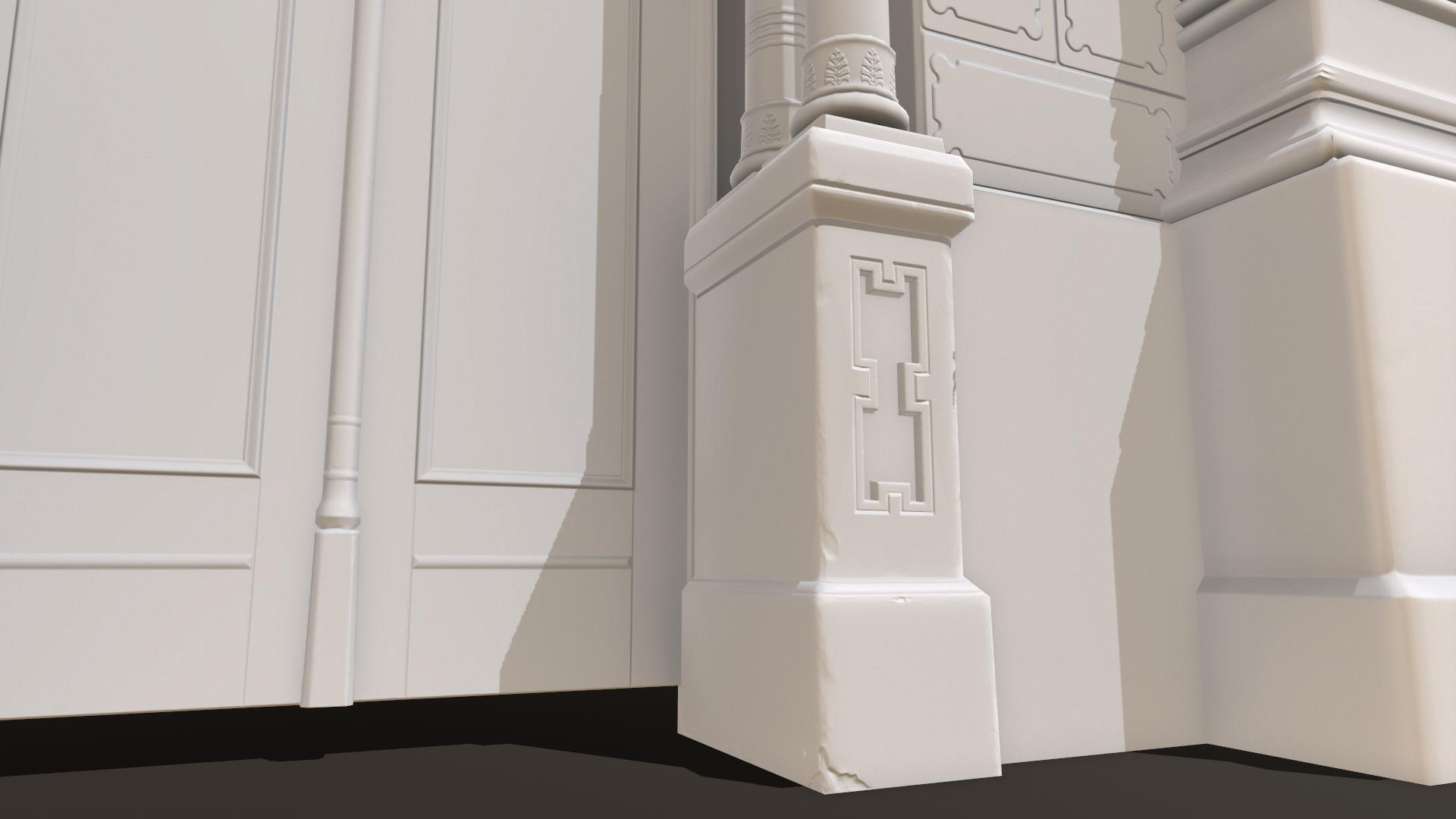
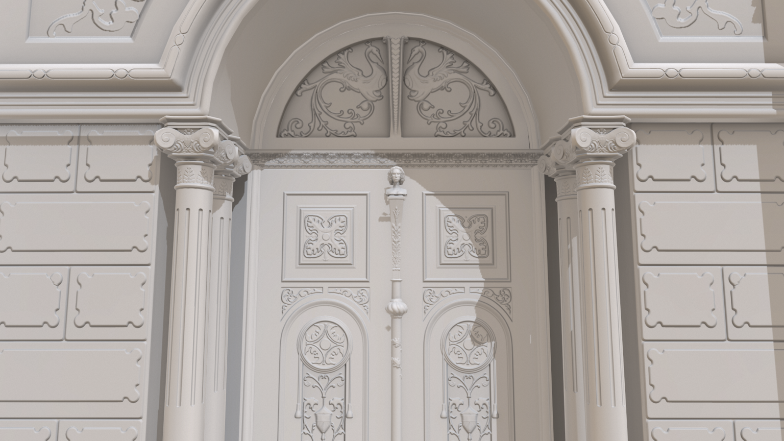
Using the same process described above, I created high and low poly versions of my column that you can see here. It took me to a long time to sculpt all the details, but I think it was worth the effort.
 So, the head of the column is rather small, and I think I did more work than was needed. Nevertheless, it looks nice to me, despite its angular form.
Now, onto the final stage of baking. After completing all baking, I noticed the quality of the parts I baked first was worse than the quality of those I did last, so, I decided to remake some elements. I devoted two days to completing the doors. While they look simple, they took a lot of time.
I also made a pedestal, and here is a recommendation for you: if you are not going to make any drastic changes in ZBrush with Dynamesh, you probably will want to just work with subdivision levels. For that you should prepare your model for successful subdivision (a copy, of course):
I had 28 million polygons in ZBrush, so I decimated it to 4 million because 3ds Max hardly perceives such huge objects. Thus, I have weird topology on the ZBrush model, but it’s okay, I think.
The Importance of Texturing & The Benefits of Baking at High Poly
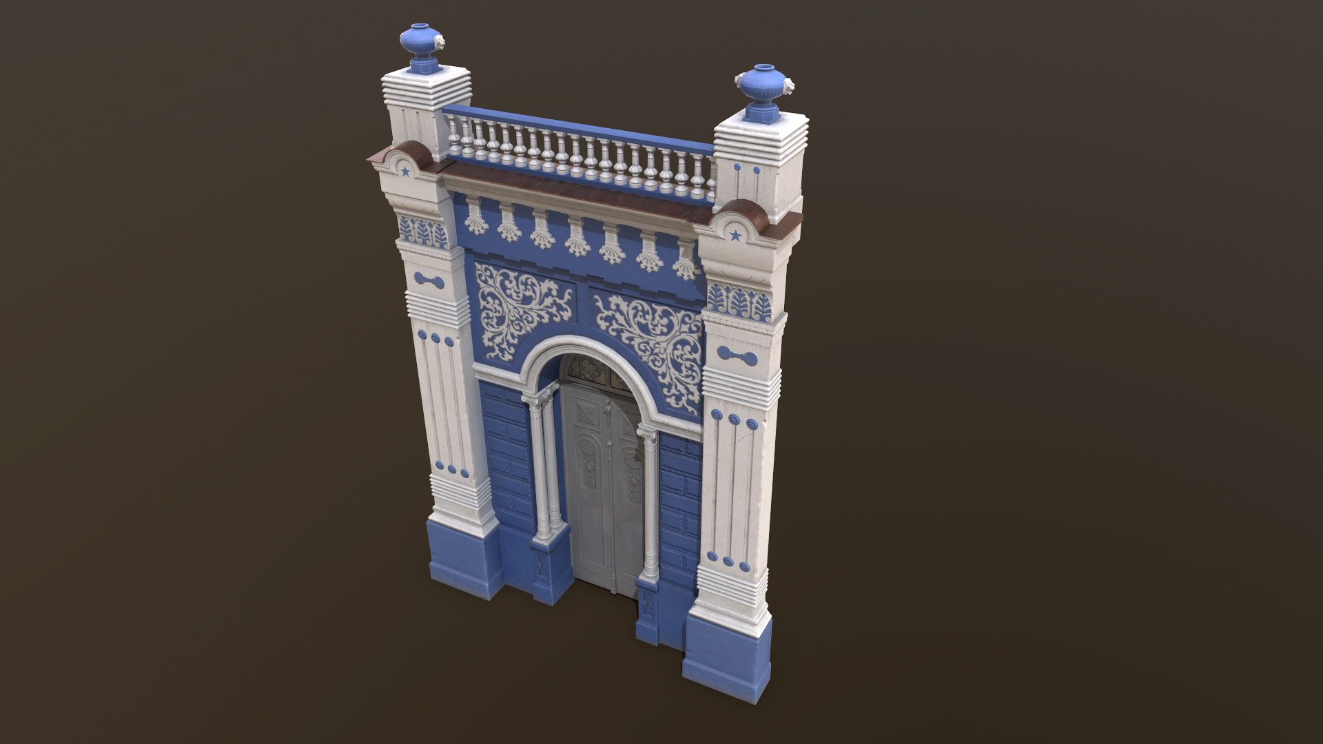
I have noticed that there are many artists who underestimate the significance of texturing. There are a great deal of models with simple textures, no textures, and no UV mapping, but do contain many geometrical details, which use a ton of memory that can overload a system. All of this can all be optimized with the use of normal maps. To use them, it is very important to have qualitative topology, correctly assigned smoothing groups, and correct UV layouts. Here is an example how normals maps, AO maps, and diffuse textures can override the low poly look of any model:
Stay tuned for the next segment of the tutorial: texturing in a nutshell!


