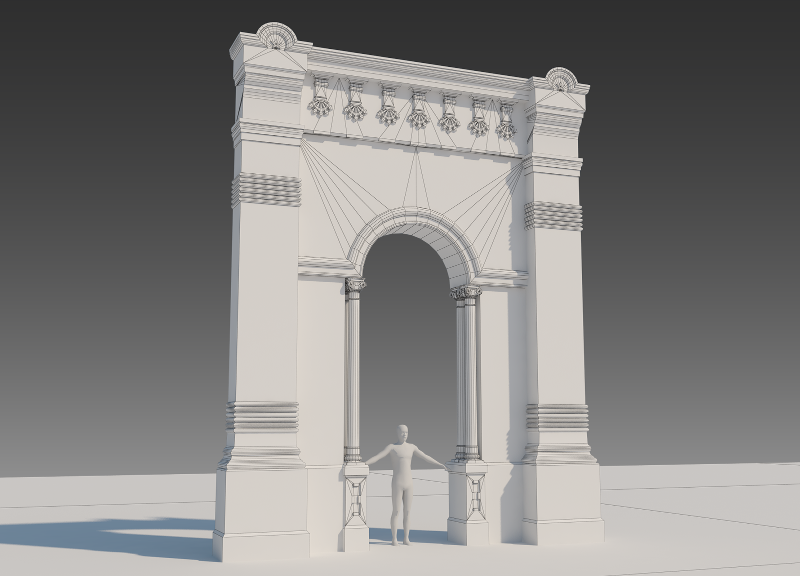
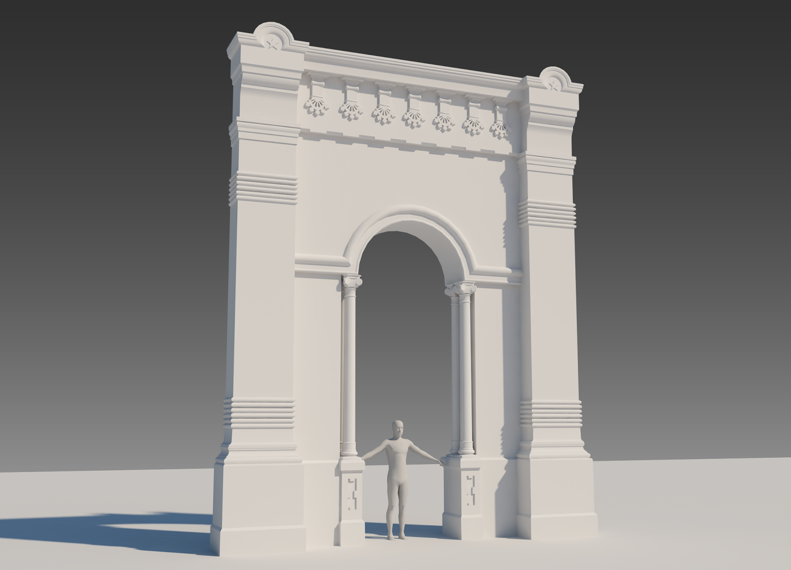
For this installation of our Artist Guest Posts, we’re really excited to present a highly detailed tutorial hosted exclusively by TurboSquid. Artist YurkP has broken down his creative process for his Cuban House of Diversity model. This tutorial is so extensive, we’ve opted to present this to you as a 6 part series. In today’s portion, YurkP will talk about best practices when starting a new project and also will go over modeling out the first shapes.
Creating Scale with References
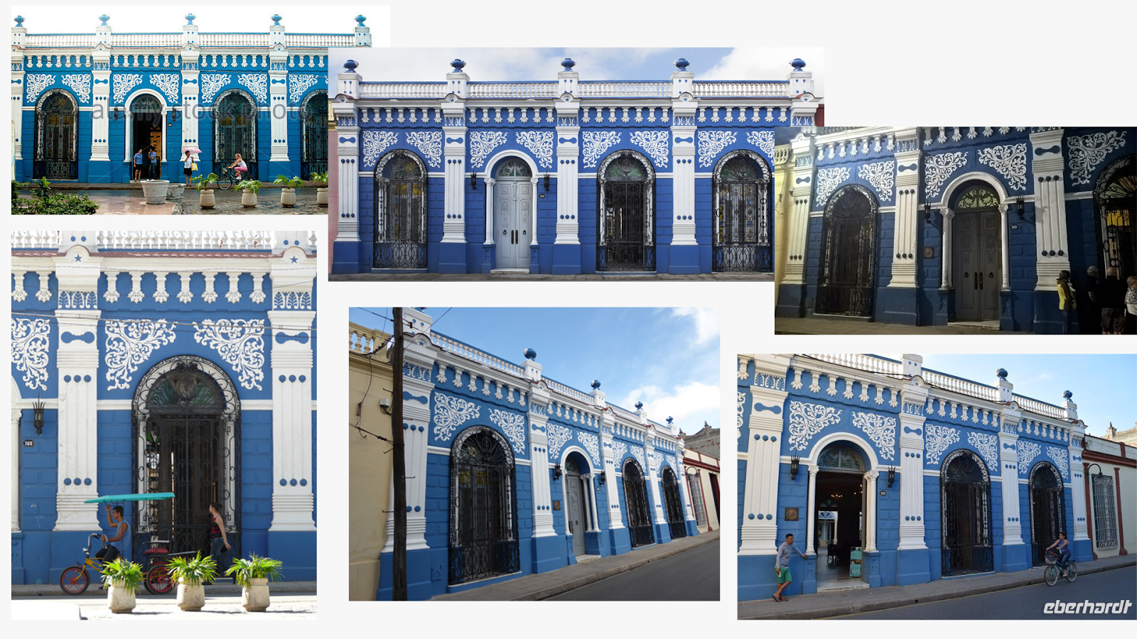
In order to create a great model, the very first point of focus is collecting references. Collect as many of them as possible, even if you want to make an original design. It’s important to study how everything works to ensure the model looks realistic (even if it's fantasy theme).
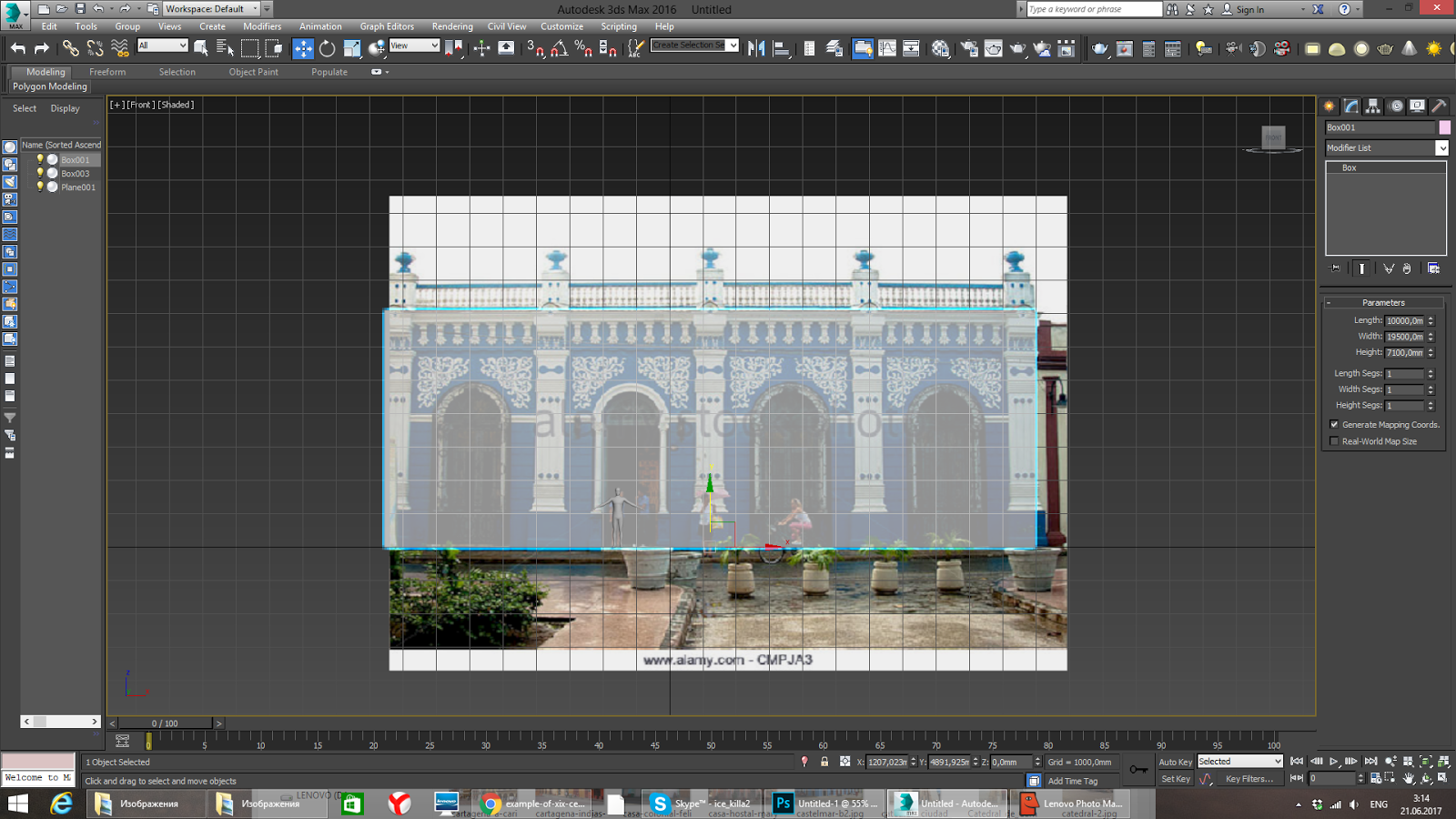
The most valuable images are front-view shots, which help you to create every element with the correct scale. Images with people in them are also important for scale. Here are the reference images I used.
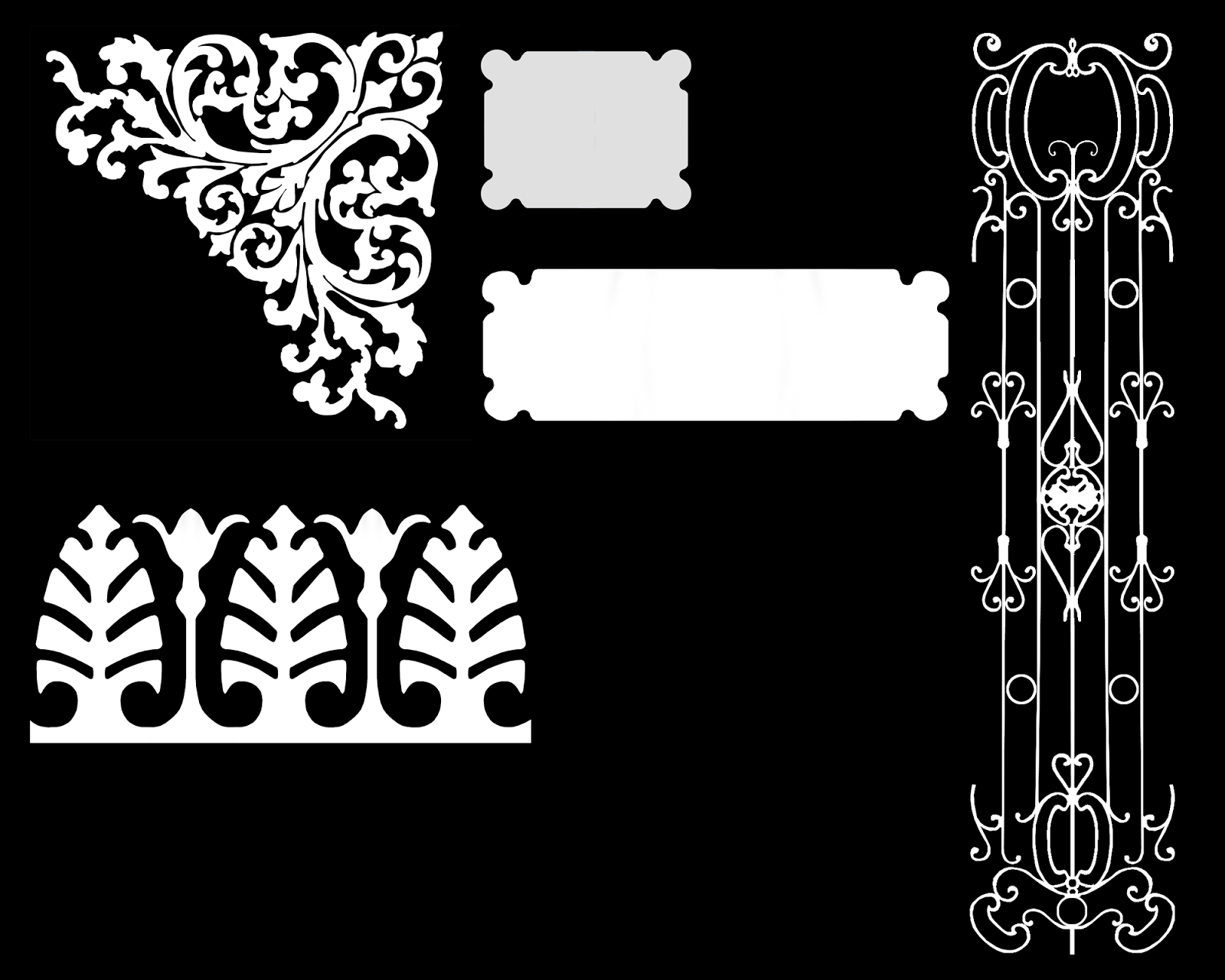
I began this process with several blanks. Here, I hand-painted some alphas in Photoshop for use in opacity stacks, further sculpting in ZBrush, or for painting in Substance Painter.
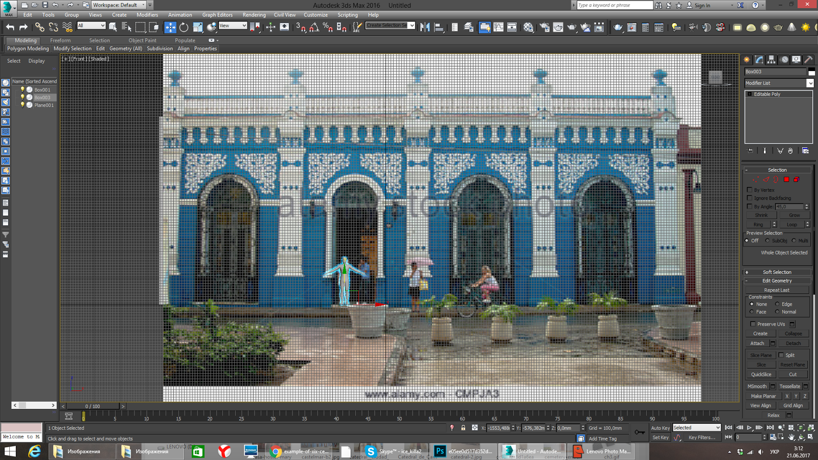
To begin the scene setup, I started by picking the correct scale and form a little blocking. Here, I used a human model combined with my reference image, which had human subjects in it. I scaled everything so the people on the image had a correspondent size to my human model. I also created a box to so I could get a sense of the size of the building.
Modeling the Pillars
Next, I began modeling some simple, large pillars. Your workflow may differ from mine, but this was a good start for me.
 In steps 1-3, I created a box and extruded the edges to achieve the desired result. Step 4 shows the top of the pillar. I created it with the Spline and Sweep Modifiers and some polygon work after conversion. Then, I connected this new shape with my pillar, dot by dot, and connected vertices with edges. Having the correct topology from the beginning is very crucial to avoiding mistakes, so I deleted the back side of the pillar and also the bottom. If some parts that were intended to be rounded look edgy at this point, don’t worry! Don’t try to make a high poly smooth model; this workflow is universal. If you are going to make a low poly model, make sure it’s simple. If you want a model for renders and close-ups, you can subdivide it and add more edges later.
 As I continued, I made an effort to keep the pillar as low poly as possible, modeling only obvious shapes to create a silhouette. Other details, such as decorations and volutes, would be sculpted and baked as normal maps, which is a good optimization point. Normal maps allow you to recreate the details on a low poly model without additional geometry.
Creating the Column Capital
Here, I will explain how I created the low poly column's capital.
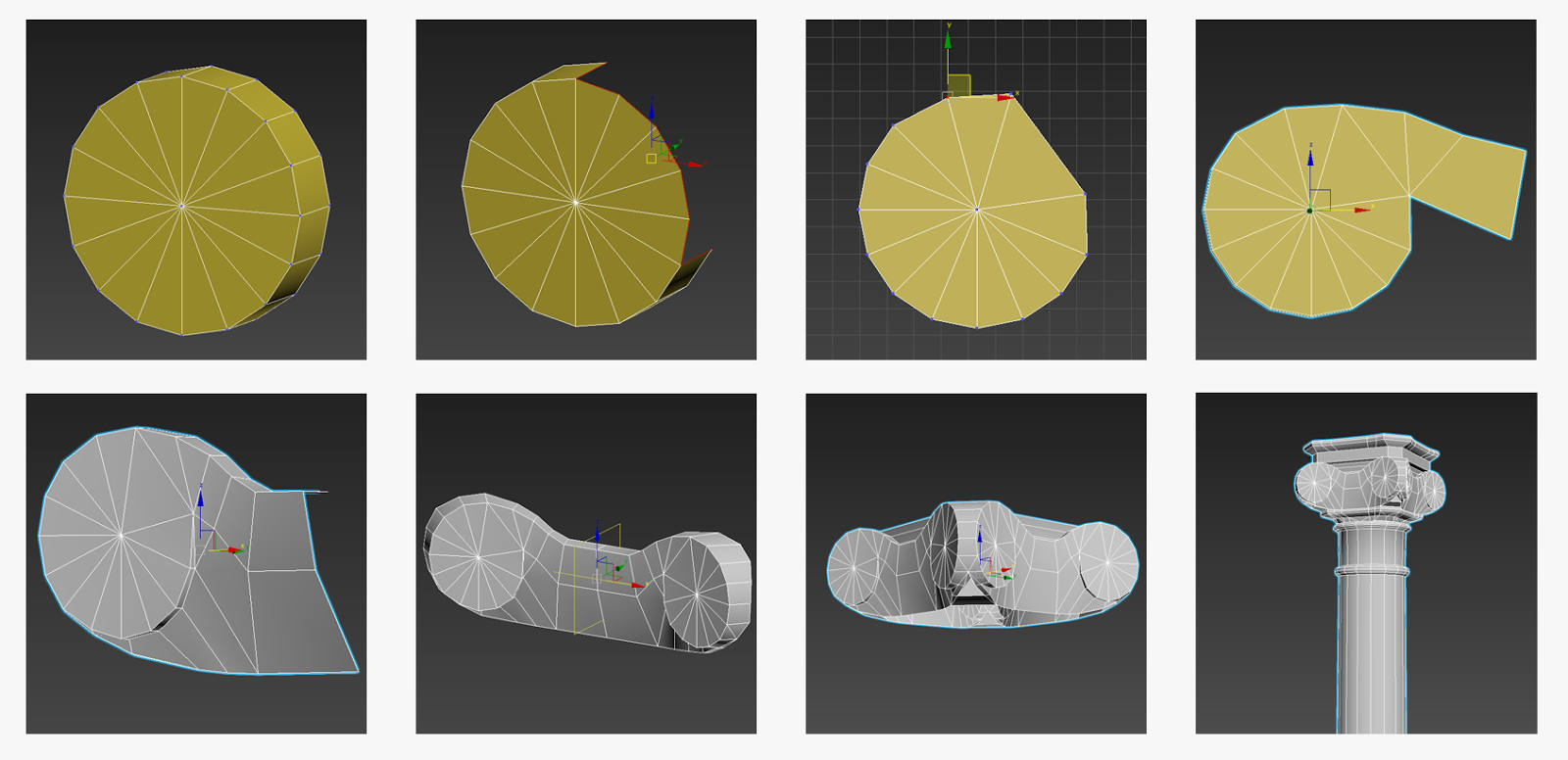
I started with a simple cylinder with 16 sides and deleted some outer polygons and collapsed vertices together. Then, I extruded the longer side, trying to recreate a volute's form. It was rough, so I spent some time playing with the polygons to create the desired shape. Then I turned it 15 degrees and mirrored with Symmetry Modifier once to get the full side of the capital. Note: always check the vertices of welding edges--if they aren't connected, you will need to connect them manually and delete that welding edge to optimize the model. From here, I mirrored my capital at 45 degrees. From here, I made several improvements and corrections and mirrored it once more at 90 degrees. After that, I did some optimization and topological rework. Make sure you don't have N-gons.
 Another element was a part of cornice decor. I began creating this element with a successfully extruded spline. Sometimes, problems can occur and extrusion won't work as it should. In this case, you can try checking if all the dots are connected; there should be no holes. Another problem you might run into is extruding in the wrong direction. In order to avoid this, you need to turn on the view of the direction you need to extrude, then draw another spline near the spline you previously created. Then, attach the first spline to the new one, and delete the new one. Now you can extrude it painlessly. This is a solid model without floating geometry, made with different pieces. I have attached two pieces, extruded, welded vertices, fixed the smoothing groups, and created clean topology.
Using the above elements and some other I created (not shown in this tutorial), I generated this building by copying elements.
I only did this to see how it will look, and it will not remain this way. I needed to finish a column and a pillar to the end and copy them only after that. This helps to save time and memory. Not only that, but I’ll be able to get higher resolution from my textures if I unwrap each element once.
Modeling the Door
For the door, I used a photo reference to create a box with the correct real-world size.
 From there, I created a cylinder with 24 sides and placed it over a door base (image 1) and then converted it to editable poly and deleted the cap and lower half (image 2). The lowest edges were extruded and connected at the bottom, and I pushed the "cap holes" button in Editable Poly menu (image 3). Unfortunately, it didn’t turn out very well and is a boolean operation. I try to avoid them because they can create unwanted vertices, delete faces, break shading, and give any other undesirable results. BUT. Sometimes, it is a nice and easy way to create a hole in the object. So as you see it worked fine and subtracted the piece as I wanted (image 4). From there, I deleted all excess faces and capped a hole creating an N-gon (image 5). In order to correct the topology, I connected the vertices (image 6) -- never miss this important step. Next, I used "inset" operation from Editable Poly menu to create the frame, and also I used Bevel operation (image 7). In order to make a double window above the door, I created a half cylinder with an additional edge (image 8), used inset operation again (image 9), and fixed the topology.
After that, I created a pillar in the middle of two doors. It needed to be as simple and primitive as possible if the model is intended for real-time renders. This pillar has small polycount, but it is deep in the niche, and the player won't mind it.
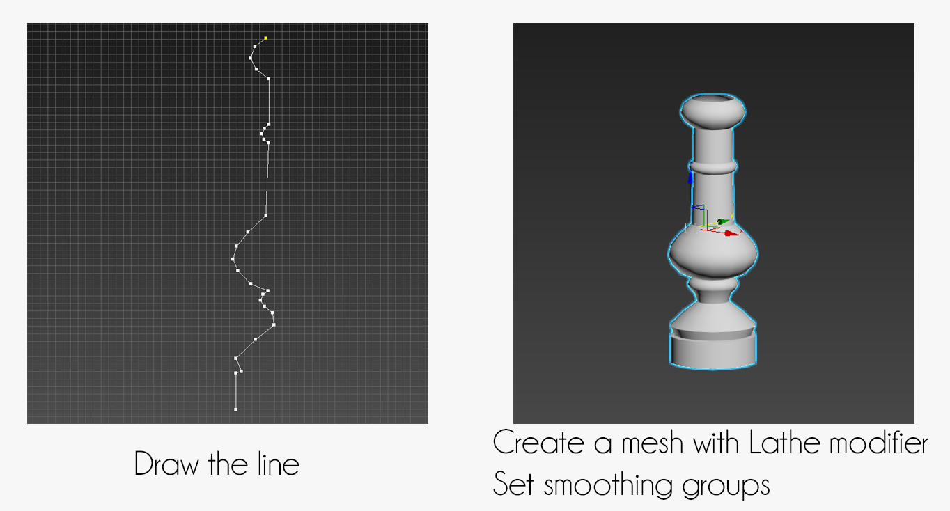
 I started with a Spline which repeats the outer edge of a pillar (image 1) and then applied a Lathe modifier with 10 sides (image 2). At the top, I connected the dots (image 3) and then extruded the squared mesh with move and scale (image 4). Moving on, I decided to create a primitive head. No need for topology like that of models used for animation; my head just needed to keep a silhouette. To do this, I created a box and applied TurboSmooth modifier with 2 iterations to produce a sphere with quads (image 5). This type of sphere is easier to work with than a standard sphere. While I worked with the polygons to mimic the form of a human head (image 6), I created such an ugly thing (image 7). From there, I attached the head to the top of the pillar and connected them with polygons (image 8). At the end of this process, I brought all pieces together (image 9) to check how it will look. Don’t worry--it will look better with baked normal maps.
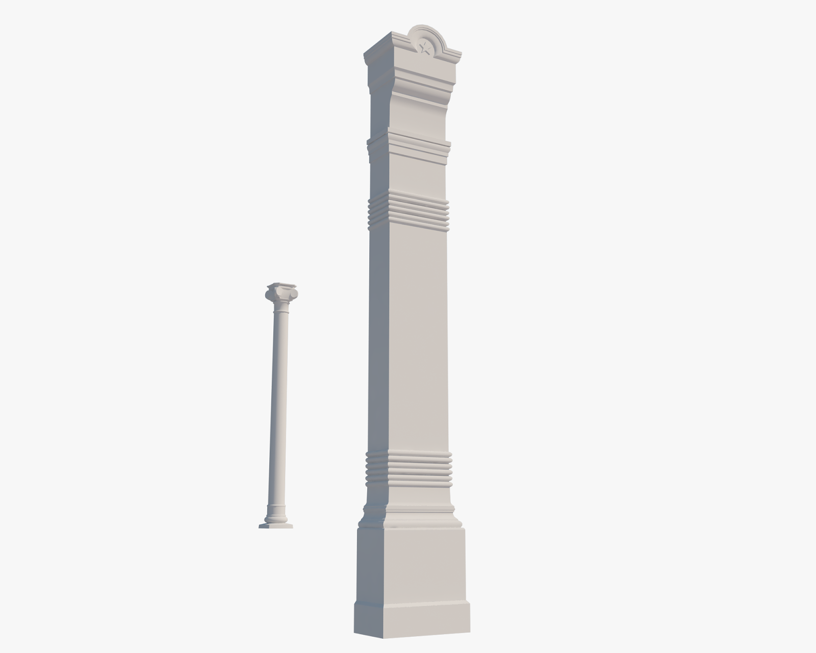
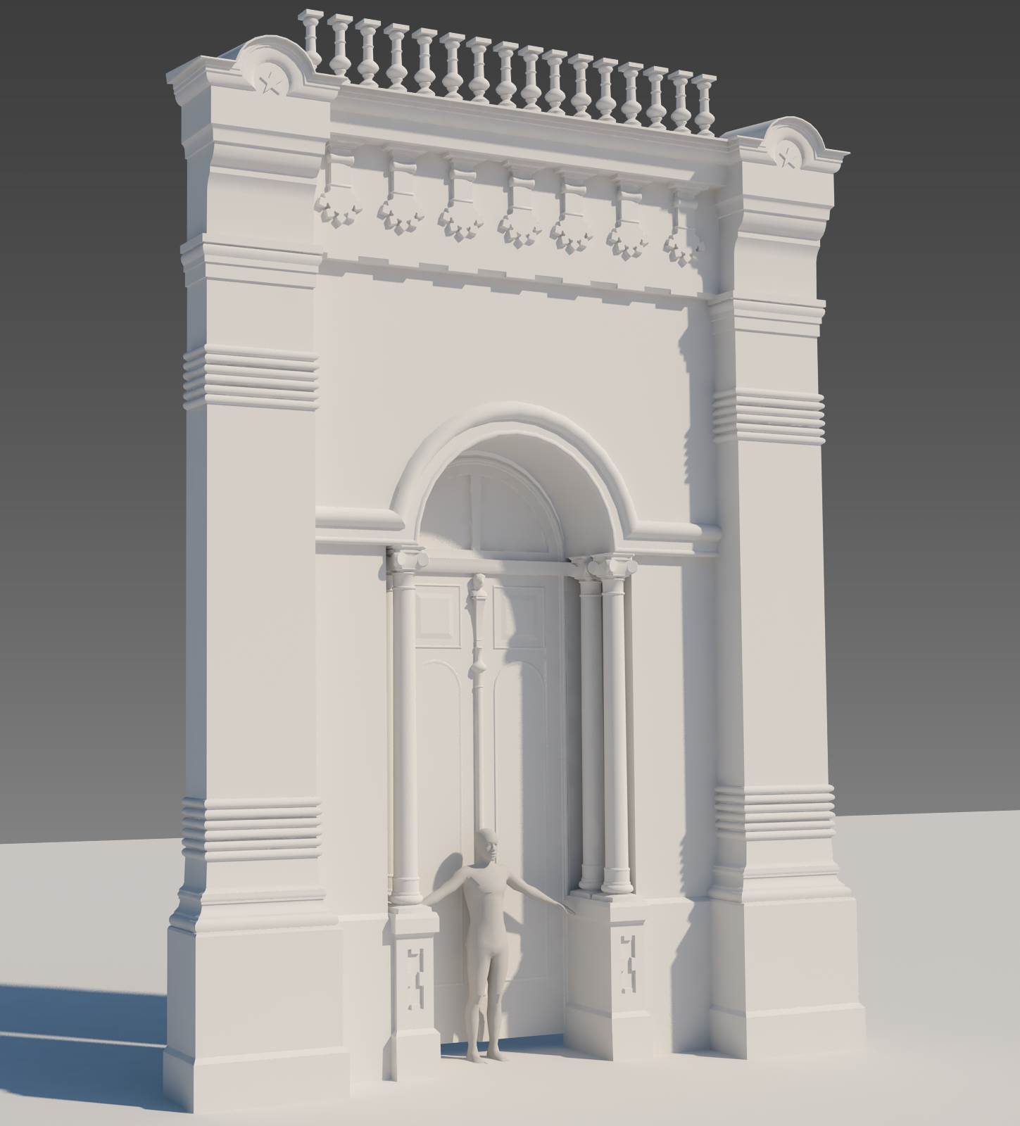
Here is a raw render with all the elements present at the moment:
Stay tuned for the next segment of the tutorial: flipped normals and smoothing groups!

