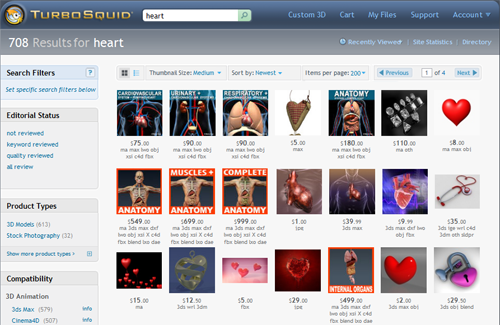
When we’ve talked to our customers one-on-one about their experiences in searching for 3D models at TurboSquid, a theme keeps coming up: borders, text, and badges on Search images are unappealing, and can even make a product look unprofessional.
Some artists use borders and text to make their models “stand out” in Search, but our customers feel differently. A clean presentation showing just the model is what catches the customer’s eye. The thumbnail shown in Search is determined by the Signature Image in your published product.
In this video, one of our top customers explains how he feels about these types of thumbnails in Search.

